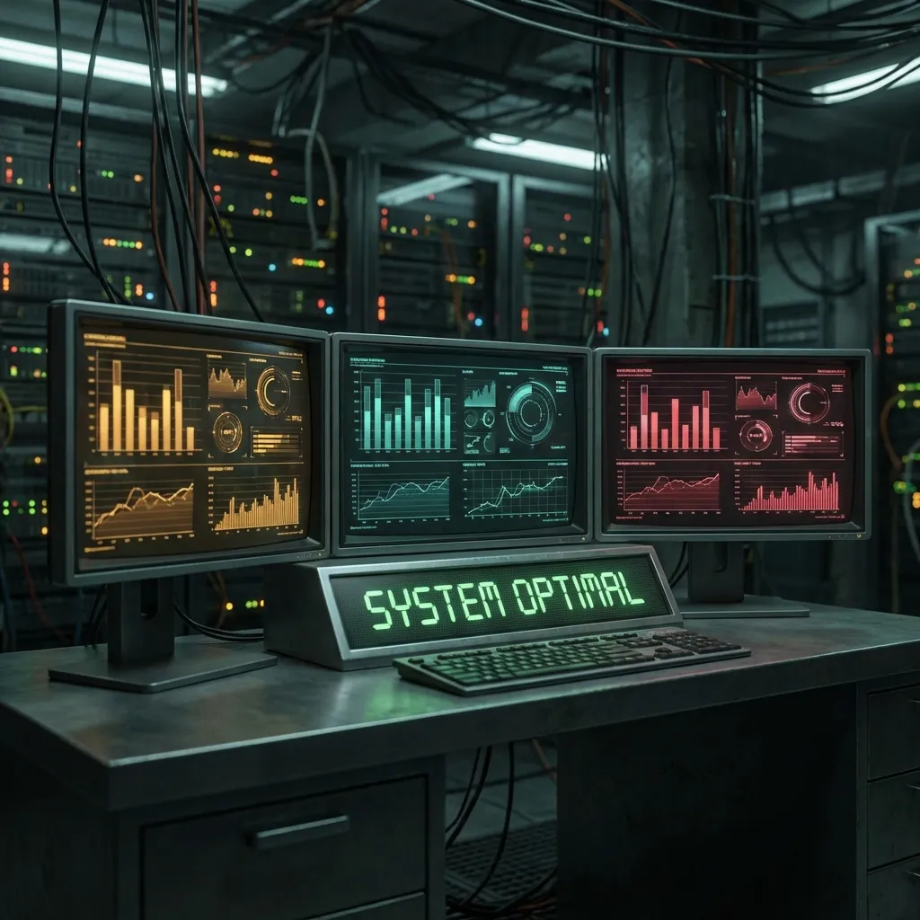
The Problem: Too Many Tabs
You know the feeling. You have a Proxmox tab open for the remote hypervisor. Another for the local one. A Portainer tab for Docker. A terminal running htop. A glances web UI on another monitor.
I was drowning in tabs.
With infrastructure spanning the local network (10.42.0.x) and a remote network (192.168.20.x), I needed a “Single Pane of Glass”. A real dashboard.
Enter Homepage.
The Goal
One dashboard to rule them all:
- Proxmox Status: CPU, RAM, VMs for both hosts
- Build Cluster: Visualize the Gentoo compilation workers
- Network: Router status, bandwidth
- Media: Plex, Tautulli, storage usage
- Aesthetics: Dark mode, sleek icons, data density
The Challenge: Cross-Network Visibility
The first hurdle was the network split. My dashboard was running on the local K3s cluster. But half my infrastructure (the big storage servers) lives on the remote network.
Tailscale bridges the gap, but even magic needs configuration.
I had to ensure the Homepage container could route to the 192.168.20.x subnet. Set up subnet routers, then configure Homepage to use http proxy mode for some services and direct IP routing for others.
The Glances Version Problem
Here’s a fun one I didn’t see coming.
I love Glances. It’s the best top replacement out there. Homepage has a great Glances widget.
But the older Proxmox host (Debian 12) ships with Glances v3.3.1. The rest of the fleet (Gentoo, newer Proxmox) runs Glances v4.
Homepage’s widget failed silently. The fix? Explicitly telling Homepage which version to speak.
- Old Proxmox Host:
    widget:
        type: glances
        url: http://10.42.0.200:61208
        version: 3  # <--- The magic number

- New Proxmox Host:
    widget:
        type: glances
        url: http://192.168.20.100:61208
        version: 4
Green lights everywhere.
Visualizing the Build Cluster
The Gentoo build cluster is the heart of the system. Workers scattered across both networks:
- LXC containers on the local Proxmox
- LXC containers on the remote Proxmox
- Docker containers on Unraid
- A dedicated test VM
I wanted to see them all side-by-side. Initially, I just dumped them in a list, but the widgets were huge.
Switched to a “Matrix” layout:
# settings.yaml
layout:
  Build Workers:
    style: row
    columns: 4
Now I can see CPU load across the entire cluster in one glance. When a compile job hits, the whole row lights up red. Beautiful.
Fixing Synology Sensors
One last annoyance: The Synology NAS units weren’t showing disk I/O in the Glances widget.
The Glances API was reporting fs:/volume1 or md2. Homepage wanted a physical disk identifier.
Dug into the config and mapped it to disk:sda. Suddenly, the read/write graphs came alive.
- Synology NAS:
    widget:
        type: glances
        url: http://192.168.20.7:61208
        disk: sda  # Not md2 or /volume1
        version: 4
The Result
The dashboard now monitors:
- 2 Proxmox clusters
- 3 NAS units
- 4 build workers
- Network topology across both sites
It’s fast, comprehensive, and data-dense. One tab instead of twelve.
Homepage Tips
Version conflicts: Always check which Glances version your hosts run. Set it explicitly in the widget config.
Cross-network routing: If your Dashboard container can’t reach a host, it fails silently. Test with curl from inside the container first.
Layout density: Use columns: N and style: row to pack more widgets horizontally.
Disk sensors: Synology and Linux software RAID report different disk identifiers than Glances expects. Check glances --stdout disk to find the right one.
Next up: Getting Tautulli to stop timing out…
